Driving Chemical Industry Excellence with Interactive Power BI Dashboards
Introduction
The chemical industry relies heavily on precise and timely data to ensure smooth operations, maintain production efficiency, and manage inventory effectively. To meet these needs, I created a comprehensive Power BI dashboard tailored for the chemical industry. This dashboard is divided into three main sections: Home, Raw Material, and Production Plan. In this article, I will walk you through the process of creating an interactive and insightful dashboard for the chemical industry using Power BI. This dashboard will help you monitor raw materials, production plans, and overall performance metrics, providing actionable insights to enhance operational efficiency.
Defining Purpose and User
Business Scenario
In a competitive and highly regulated chemical industry, efficient management of raw materials and production plans is crucial. The industry head at a mid-sized chemical manufacturing company wants to gain real-time insights into raw material inventory, production capacity, and overall performance metrics. The goal is to ensure optimal utilization of resources, minimize stockouts and overstock situations, and align production plans with sales forecasts.
Purpose
The purpose of this dashboard is to provide a comprehensive overview of the company’s raw material inventory and production performance. The dashboard will enable the management team to make data-driven decisions to optimize inventory levels, streamline production processes, and improve overall efficiency.
User
The primary users of this dashboard are:
- Industry Head: To monitor overall performance and make strategic decisions.
- Production Managers: To track production plans, manage raw material inventory, and ensure alignment with sales forecasts.
- Supply Chain Managers: To oversee raw material stocks, manage supplier relationships, and avoid stockouts or overstock situations.
Step 1: Data Preparation
Before creating the dashboard, ensure you have the following data:
- Daily Stock Production Data:
- Date
- Type
- Stock In
- Stock Out
- Current Stock


2. Raw Material Data:
- Date
- Type Material
- Stock In (Kg)
- Stock Out (Kg)
- Current Stock (Kg)

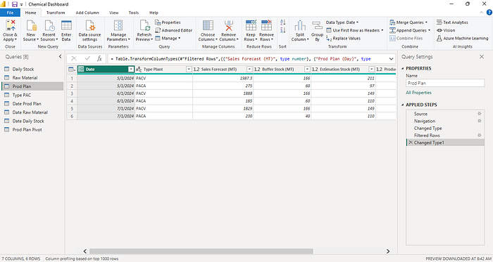
3. Production Plan Data:
- Production Plan (MT)
- Sales Forecast (MT)
- Estimation Stock (MT)
- Buffer Stock (MT)
- Prod Plan (Day)

Step 2: Load Data into Power BI
- Open Power BI Desktop.
- Click on Get Data and select your data source (e.g., Excel).

3. Load the data tables into Power BI.
4. Using Power Query for cleaning and transforming data.
5. Create a Date Table using Power Query to facilitate time-based analysis

Step 3: Data Modeling
- Create Relationships: Link the tables based on common fields, such as Date and Type Material.

Step 4: Crafting Essential KPIs
Key Performance Indicators (KPIs) are the backbone of your dashboard. Let’s create some KPIs using calculated measures:
- Total Current Stock: This KPI provides a snapshot of the current stock levels by summing up the stock values from the most recent date available in the dataset. This KPI is crucial for understanding how much inventory is on hand at the end of the most recent period, which is essential for inventory management, production planning, and meeting customer demand.
Total Current Stock =
CALCULATE(
    LASTNONBLANKVALUE(
        'Daily Stock'[Date],
        (SUM('Daily Stock'[Stock]))/1000
    )
)
2. Total Stock In: This KPI measures the total amount of stock received into the inventory over a specific period. This KPI is essential for tracking the inflow of materials and products, ensuring that inventory levels are maintained to meet production and sales demands.
Total Stock In = CALCULATE(
    (SUM('Daily Stock'[Stock In]))/1000
    )
3. Total Stock Out: This KPI measures the total amount of stock issued from the inventory over a specific period. This KPI is crucial for tracking the outflow of materials and products, ensuring that inventory levels are accurately monitored and controlled.
Total Stock Out = CALCULATE(
    (SUM('Daily Stock'[Stock Out]))/1000
    )
4. Max Capacity Utilization: This KPI measures the percentage of the production capacity that is being utilized. It helps in identifying whether the production facilities are being over or under-utilized.
MaxCapacityUtilization =
DIVIDE(
    SUM('DailyStock'[Current Stock]),
    SUM('ProductType'[Max Capacity])
)
5. Net Stock Change: This KPI calculates the net change in stock levels by subtracting the total stock out from the total stock in. It provides insight into the overall stock movement within a specific period.
Net Stock Change = [Total Stock In (Kg)] - [Total Stock Out (Kg)]6. Average Production Plan: This KPI indicates the average planned production volume over a certain period. It helps in understanding the expected production output.
Average Production Plan = AVERAGEX(
    'Prod Plan',
    'Prod Plan'[Production Plan (MT)]
)
7. Buffer Stock Coverage: This KPI measures the percentage of buffer stock available relative to the estimated stock. It helps in assessing whether there is sufficient buffer stock to handle any unforeseen demands.
BufferStockCoverage =
DIVIDE(
    SUM('ProductionPlan'[Buffer Stock]),
    SUM('ProductionPlan'[Estimation Stock])
)
8. Stock Coverage Ratio: This KPI shows the ratio of estimation stock to the sales forecast. It indicates how well the stock levels are aligned with the expected sales, helping to avoid stockouts or excess stock.
StockCoverageRatio =
DIVIDE(
    SUM('ProductionPlan'[Estimation Stock]),
    SUM('ProductionPlan'[Sales Forecast])
)
9. Days of Supply: This KPI calculates the number of days the current stock can last based on the average production plan. It helps in planning and ensuring that production can continue smoothly without interruptions due to stock shortages.
DaysOfSupply =
DIVIDE(
    SUM('DailyStock'[Current Stock]),
    AVERAGE('ProductionPlan'[Prod Plan (Day)])
)
Step 5: Creating Visuals
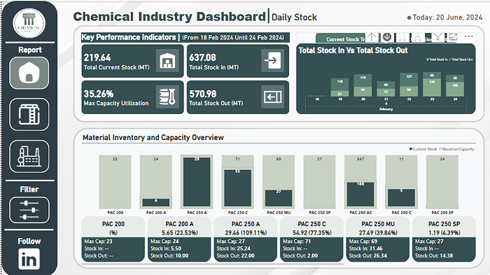
- Home Page Visuals: The Home Page of the dashboard is designed to provide a high-level view of key metrics and trends. It includes:
- Card Visuals: Display Total Current Stock, Max Capacity Utilization, Total Stock In, and Total Stock Out.
- Stacked Column Chart: Shows Current Stock vs. Maximal Capacity for each type of product.
- Trend Visual Using Area Chart: Visualizes trends over time, such as changes in stock levels.
- Detailed Card Info: Below the column chart, detailed card visuals show specific information for each type of product.

2. Raw Material Page Visuals: On the Raw Material page, focus on tracking the inflow and outflow of raw materials essential for production. Use the following visuals:
- Card Visuals: Display Total Current Stock, Total Stock In, Total Stock Out and Net Stock Change for raw materials.
- Stacked Column Charts: Compare stock in and stock out for different raw materials.
- Trend Visuals: Analyze trends in raw material usage over time.
- Interactive Raw Material Filtering: Power BI’s dynamic filters enable users to filter data by raw material type with a single click.

3. Production Plan Page Visuals
The Production Plan page is dedicated to monitoring production plans and their execution. Key visuals include:
- Card Visuals: Display KPIs like Average Production Plan, Buffer Stock Coverage, Stock Coverage Ratio, and Days of Supply.
- 100% Stacked Bar Charts: This chart visualizes key production metrics, including Production Plan (MT), Sales Forecast (MT), Estimated Stock (MT), Buffer Stock (MT), and Production Plan (Days), for each plant.
- Line Charts: Trend analysis of production plan and sales forecast execution over time.
- Stacked Column Charts: These charts visualize buffer stock and estimated stock, allowing you to compare them on a monthly basis.

Step 5: Adding Interactive Features

- Slicers:
- Add slicers for Date (Month and Year), Type Material, and any other relevant fields to filter data dynamically.
2. Bookmarks and Page Navigation:
- Create bookmarks for different views of the data.
- Add buttons for easy navigation between Home, Raw Material, and Production Plan pages.
3. Drill Down:
- Enable drill-down on charts to analyze data at different levels of granularity (e.g., monthly to daily).

Step 6: Customizing and Formatting
- Visual Formatting: Customize the appearance of each visual for clarity and aesthetic appeal.

2. Dashboard Theme: Apply a consistent color theme to the dashboard.
Step 7: Publishing and Sharing
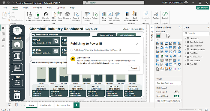
- Publish to Power BI Service: Once your dashboard is complete, publish it to the Power BI service.

- Share with Stakeholders: Share the dashboard with relevant stakeholders and set up scheduled data refreshes.

Insights from the Dashboard
- Current Stock and Capacity Utilization:
- The dashboard reveals the total current stock is 262.61 MT, with a max capacity utilization of 42.15%. This indicates there is room to optimize the use of capacity.
2. Raw Material Management:
- Analyzing the raw material data, significant disparities in stock levels, such as high stock out for HCl 32% and AL(OH)3, suggest potential supply chain issues or production inefficiencies.
3. Production Planning:
- The production plan data shows that PACV and PACA materials have varying production plans and buffer stocks, indicating different levels of demand and production schedules.
4. Buffer Stock and Days of Supply:
- With an average production plan of 1,122 MT and a buffer stock coverage of 58.62%, the dashboard helps ensure that there is adequate stock to meet production needs without overstocking.
5. Production Efficiency:
- The dashboard highlights that the chemical plant has an average production plan of 1,122 MT, buffer stock coverage of 58.62%, a stock coverage ratio of 23.21%, and 35 days of supply. These metrics help in planning and ensuring production continuity.
Detailed Analysis
Inventory Management
The dashboard provides a comprehensive view of inventory management, especially critical for raw materials. The significant negative stocks for HCl 32% and AL(OH)3 indicate an urgent need for restocking. Additionally, maintaining adequate safety stock levels for high-consumption materials like AM and CaCO3 is essential to buffer against supply disruptions.
Production Efficiency
With the Max Capacity Utilization at 42.15%, there is considerable room for increasing production efficiency. By optimizing production schedules and processes, the chemical plant can better utilize its capacity and meet market demand more effectively.
Supplier Coordination
Establishing reliable supply chains is crucial, particularly for raw materials with significant negative stock levels. The dashboard can help in identifying critical supply needs and coordinating with suppliers to ensure timely delivery and maintain production continuity.
Data-Driven Decision Making
Leveraging historical data to forecast future needs more accurately can enhance decision-making. The real-time insights provided by the dashboard allow for proactive inventory management and efficient production planning.
Sales and Production Alignment
Ensuring that production plans are closely aligned with sales forecasts is vital to avoid excess inventory or stockouts. The dashboard highlights the need to regularly review and adjust production plans based on actual performance and market demand.
Conclusion
Creating a chemical industry dashboard in Power BI involves careful data preparation, modeling, and visualization. By leveraging interactive features such as dynamic filters, bookmarks, and drill-down capabilities, you can gain deep insights into raw material management, production planning, and overall performance. This dashboard serves as a powerful tool to enhance decision-making and operational efficiency in the chemical industry. This project showcases the potential of data visualization and analytics in transforming raw data into actionable insights, driving operational excellence and strategic growth.
