Enhance Your Power BI Bar Charts: Using DAX to Add Custom Labels Above Bars
Introduction
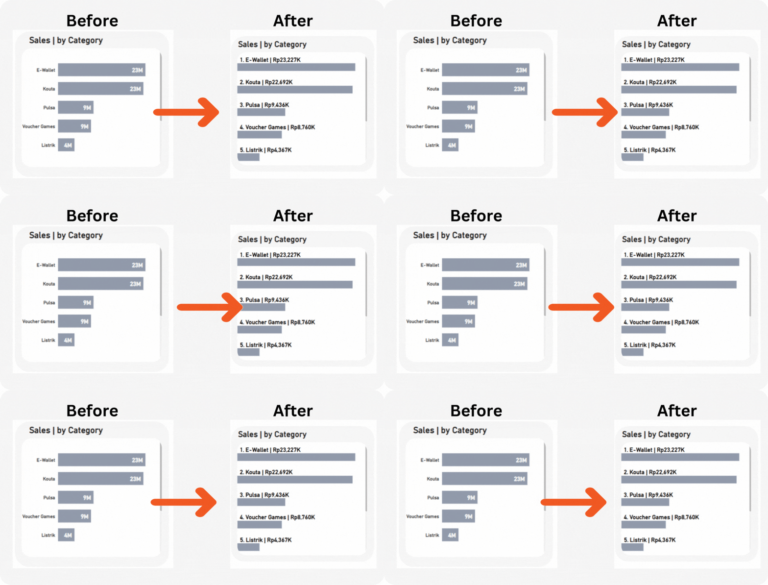
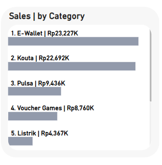
In the world of data visualization, clarity and accessibility are paramount. Effective charts can significantly enhance our understanding of complex datasets and aid in decision-making. However, standard bar charts in Power BI often fall short in providing clear data labels, which can hinder quick comprehension. This article will walk you through using DAX and a clustered bar chart to place custom labels above bars, improving the readability and informativeness of your visualizations.

Table of Contents
- Introduction to Power BI Bar Charts
- The Benefits of Custom Labels
- Step-by-Step Guide to Adding Custom Labels Using DAX
- Conclusion and Best Practices
1. Introduction to Power BI Bar Charts
Power BI is a powerful tool for data analysis and visualization, offering a wide array of chart types and customization options. Bar charts, one of the most commonly used chart types, effectively display categorical data. Despite their utility, the default bar charts in Power BI often place labels inside the bars, which can obscure data values and reduce clarity.
2. The Benefits of Custom Labels
Custom labels improve the readability of charts by providing clear, immediately visible data points. Placing labels above bars ensures they are not obscured by the bars themselves, making the chart easier to interpret at a glance. This small adjustment can make a significant difference, especially in presentations and reports where quick comprehension is key.
3. Step-by-Step Guide to Adding Custom Labels Using DAX
In this section, we will guide you through creating a clustered bar chart with custom labels using DAX.
a. Create a Basic Clustered Bar Chart
- Import your dataset into Power BI:
- Open Power BI Desktop.
- Click on “Get Data” and select your data source.
- Load your dataset.
2. Create a clustered bar chart:
- Select the clustered bar chart visual from the Visualizations pane.
- Drag the relevant fields to the x-axis (e.g., Category) and y-axis (e.g., Sales).
- Screenshot/Illustration: Display a simple clustered bar chart with inside labels.

b. Create a DAX Measure for Labels
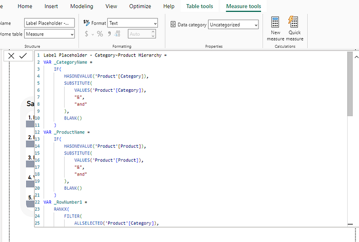
To create custom labels, we will use DAX (Data Analysis Expressions).
1. Create a new measure:
- Go to the “Modeling” tab.
- Click on “New Measure”.
- Enter the following DAX formula:
Label Place = 0Label Placeholder - Category-Product Hierarchy =
VAR _CategoryName =
IF(
HASONEVALUE('Product'[Category]),
SUBSTITUTE(
VALUES('Product'[Category]),
"&",
"and"
),
BLANK()
)
VAR _ProductName =
IF(
HASONEVALUE('Product'[Product]),
SUBSTITUTE(
VALUES('Product'[Product]),
"&",
"and"
),
BLANK()
)
VAR _RowNumber1 =
RANKX(
FILTER(
ALLSELECTED('Product'[Category]),
CALCULATE('Measure'[Measure Selection]) <> 0
),
CALCULATE('Measure'[Measure Selection]),
,
DESC,
DENSE
)
VAR _RowNumber2 =
RANKX(
FILTER(
ALLSELECTED('Product'[Product]),
CALCULATE('Measure'[Measure Selection]) <> 0
),
CALCULATE('Measure'[Measure Selection]),
,
DESC,
DENSE
)
VAR _MeasureValue = 'Measure'[Measure Selection]
VAR _FormattedValue =
SWITCH(
TRUE(),
SELECTEDVALUE('Measure'[Metric]) = "Profit", FORMAT(_MeasureValue, "Rp#,##0,K"),
SELECTEDVALUE('Measure'[Metric]) = "Sales", FORMAT(_MeasureValue, "Rp#,##0,K"),
SELECTEDVALUE('Measure'[Metric]) = "Transactions", FORMAT(_MeasureValue, "#,##0"),
FORMAT(_MeasureValue, "#,##0.00")
)
VAR _Label =
IF(
ISINSCOPE('Product'[Product]),
IF(
NOT ISBLANK(_MeasureValue) && _MeasureValue <> 0,
_RowNumber2 & ". " & _ProductName & " | " & _FormattedValue,
BLANK()
),
IF(
NOT ISBLANK(_MeasureValue) && _MeasureValue <> 0,
_RowNumber1 & ". " & _CategoryName & " | " & _FormattedValue,
BLANK()
)
)
RETURN
_Label- Screenshot/Illustration: Show the process of creating the DAX measure.

c. Add the DAX Measure to the Chart
- Drag the newly created measure to the “X-axis” field well of the clustered bar chart.
- Ensure that one bar represents the actual values and the other bar represents the labels.
- Screenshot/Illustration: Demonstrate adding the measure to the chart.

d. Position the Labels
- Change the data label of the place label to the outer end and switch off the value field on the data labels of the metric (sales) value.

- Customize font size, color, and style for better visibility.
- Screenshot/Illustration: Show how to adjust label position and appearance.

4. Conclusion and Best Practices
In this guide, we explored how to enhance your Power BI bar charts by adding custom labels using DAX. Clear labeling is essential for effective data visualization, ensuring that your audience can quickly and accurately interpret the data.
Best Practices:
- Keep labels concise and informative.
- Use formatting and colors to highlight key data points.
- Regularly update your charts and labels to reflect the most current data.
By implementing these techniques, you can significantly improve the clarity and impact of your Power BI bar charts.
Call to Action
We’d love to hear about your experiences and any additional tips you might have! Share your thoughts and suggestions in the comments below. Don’t forget to follow my Medium profile for more Power BI tutorials and updates. If you found this article helpful, consider subscribing to our newsletter for regular insights and tips on data visualization.
By following this detailed guide, you will be able to enhance your Power BI bar charts effectively, making your data visualizations more informative and visually appealing. Happy charting!
